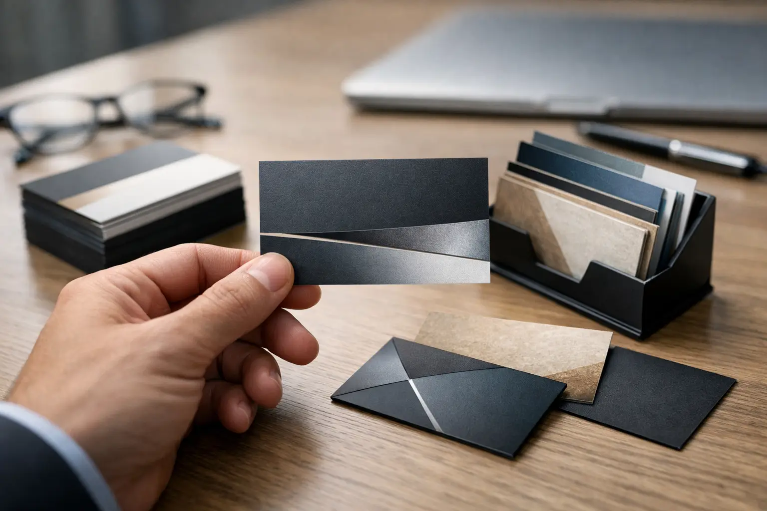
A handshake ends quickly. A professional business card design gives the conversation something to stay with - in a wallet, on a desk, or beside a monitor when the buyer is ready to act. For Canadian businesses competing for attention at meetings, trade shows, property viewings, events, and client visits, that small piece of print can carry serious commercial weight.
A card is not a miniature brochure. It has one job: make your business memorable and make the next step obvious. When the design, messaging, material, and finishing work together, it signals that your company is organized, credible, and worth contacting.
Why Professional Business Card Design Still Matters
Digital contact sharing is useful, but it is not a replacement for a well-made card. A phone tap or QR code may save details, yet it rarely creates the same physical reminder of a real conversation. The right card gives people a tangible cue to remember who you are, what you do, and why they should call.
This matters even more in relationship-led industries. Calgary real estate professionals, construction firms, consultants, hospitality brands, financial teams, event businesses, and service providers often earn work through trust before a formal proposal ever appears. A flimsy or crowded card can quietly weaken that first impression. A considered one adds confidence.
The best cards also support a larger brand system. Your website, signage, social graphics, proposals, packaging, photography, and printed collateral should feel like they came from the same business. If the card looks disconnected from everything else, it creates friction at the exact moment you want recognition.
Start With the Action You Want
Before choosing colours or finishes, decide what the recipient should do after taking your card. Call for a quote? Visit a portfolio? Book a consultation? Follow a project page? The answer determines the information hierarchy.
For many businesses, the front should do the immediate branding work: logo, name, a short descriptor, and a visual element with a point of view. The reverse can carry practical contact details and a clear call to action. There is no fixed rule that says every card needs two sides, but using the space well usually gives the design more breathing room.
A lawyer, for example, may need a calm, direct card that puts their name and phone number first. A photographer may lead with a striking image treatment and a portfolio QR code. A home builder could use a subtle material-inspired texture while keeping the contact side exceptionally clean. The right approach depends on the buying journey, not on what looks fashionable in isolation.
Give Every Element a Job
Business cards become ineffective when every available millimetre is filled. Your logo does not need to compete with five services, three phone numbers, social icons, a slogan, an address, and a large QR code. If everything is important, nothing is.
In most cases, include the person’s name, role, company name, phone number, email address, website, and one useful next action. A physical address is worthwhile when people visit your location or when local presence is a major trust signal. Otherwise, it may be space better used for clarity.
Use a QR code only when it leads somewhere relevant and mobile-friendly. Sending a prospect to a generic homepage can feel lazy. Sending them to a booking page, active listing, current portfolio, menu, product page, or tailored contact form gives the scan a reason.
Build for Recognition, Not Decoration
Strong business card design is built around a distinct brand decision. That might be a confident colour field, refined typography, an unexpected orientation, an embossed mark, or an image that reflects the work. It does not need all of these at once.
A premium look often comes from restraint. Generous white space, excellent type, sharp alignment, and a quality stock can make a card feel more expensive than a design overloaded with glossy effects. The goal is not to impress other designers. The goal is to make prospective clients feel they are dealing with a business that pays attention.
Colour deserves special attention. Bright colours can be memorable and energetic, while black, deep blue, charcoal, and warm neutrals can communicate authority or refinement. But colours that look powerful on screen may print differently. Brand colours should be tested in print, especially when consistency matters across cards, brochures, signage, and event materials.
Typography is equally practical. A beautiful typeface that becomes hard to read at a small size is the wrong choice for contact details. Keep essential information comfortably legible. If a recipient has to squint for the email address, the card has failed a basic business task.
Choose Materials That Match Your Positioning
Paper stock is part of the message. A standard uncoated card can be clean, practical, and cost-effective. A heavier stock immediately adds substance. Soft-touch lamination can feel modern and polished, while textured, recycled, or cotton stocks may better suit brands with a crafted, architectural, natural, or sustainability-minded identity.
Special finishes can elevate the piece, but they should earn their place. Foil can create a premium focal point. Spot UV can add contrast to a logo or pattern. Letterpress and embossing offer tactile impact. Die-cut shapes can be memorable, though they are not always practical for wallets, card holders, or bulk event distribution.
There are trade-offs. A dark card with light type can look exceptional, but it may show scratches more easily. Heavy coating can feel luxurious, but may not work well if people need to write on the card. Highly unusual shapes stand out, but can become inconvenient. The best choice reflects how and where the card will be used.
For a high-volume trade show, a polished standard stock may be the smart commercial call. For a boutique firm meeting a small number of high-value clients, a heavier tactile card may justify the investment. Design is not only about visual taste. It is about making the right impression at the right cost.
Avoid the Mistakes That Make Cards Disposable
A few common choices make even capable businesses look less established. Tiny text, low-resolution logos, inconsistent fonts, and crowded layouts are obvious problems. So are generic clip-art graphics and QR codes that do not work.
Be cautious with trends that lack a connection to your brand. Clear plastic, oversized cards, loud gradients, or novelty formats can work brilliantly for the right company. Used without a reason, they can feel like a gimmick. A business card should create recognition, not confusion.
Also think beyond the card itself. If your logo is outdated, your messaging is unclear, or your website feels disconnected from your printed materials, a new card alone will not fix the issue. It can be the ideal starting point for a stronger identity, but it should be designed as part of the complete customer experience.
From Screen Proof to Print-Ready Card
The production stage is where good concepts either hold up or fall apart. A card needs correct bleed, safe margins, print-ready colour settings, and high-resolution artwork. Fine lines, small reversed type, and subtle colour shifts should be checked before committing to a full run.
Always review a physical proof when possible. Screen previews cannot accurately show paper texture, foil effect, contrast, or the true weight of a stock. Hold it under normal light. Read every detail without zooming in. Ask whether it still feels right after being handled, not just after being admired on a monitor.
A capable creative partner can coordinate the whole picture: identity, card design, print specifications, photography, website touchpoints, and campaign assets. That is especially valuable when several teams or vendors would otherwise be interpreting your brand separately. Amydia approaches this kind of work as one connected creative system, with no contracts and payment only when you are satisfied with the finished result.
Make the Card Earn Its Place
A business card is a small investment, but it should not be an afterthought. Give it a clear purpose, use only the information that helps a prospect act, and choose finishes that reflect the level at which you want your business to be perceived.
The card someone keeps is rarely the busiest one in the stack. It is the one that feels unmistakably yours and makes reaching you easy when the moment is right.